Telling a Typographic Story
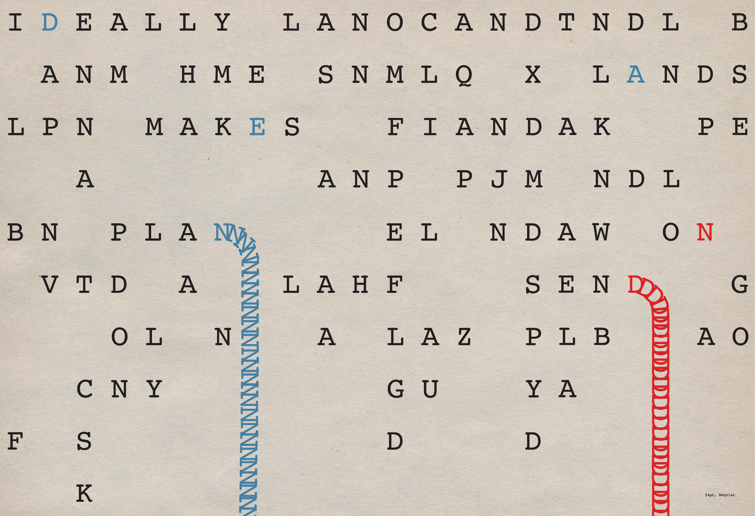
Courier Type Specimen
Many people dislike the typeface Courier because it represents the mundane. It’s pragmatic and highly functional, often used in administrative settings and by older computer software. And that’s why I love it. Its tone is so embedded in visual culture that when you use it you know exactly how it will be perceived.
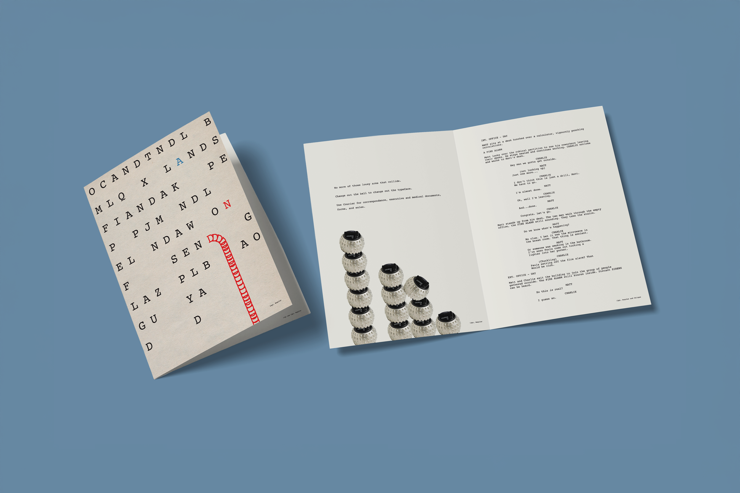
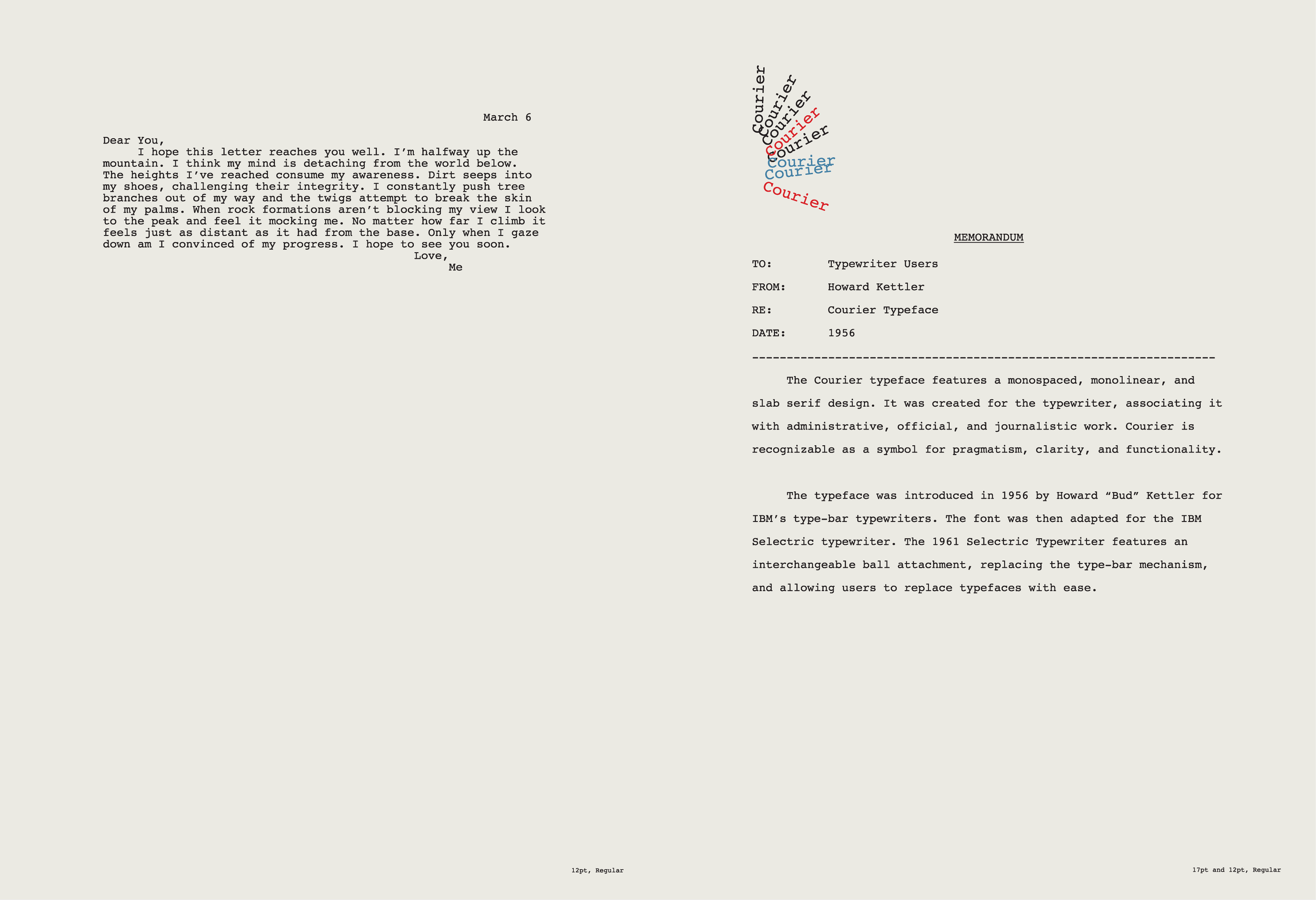
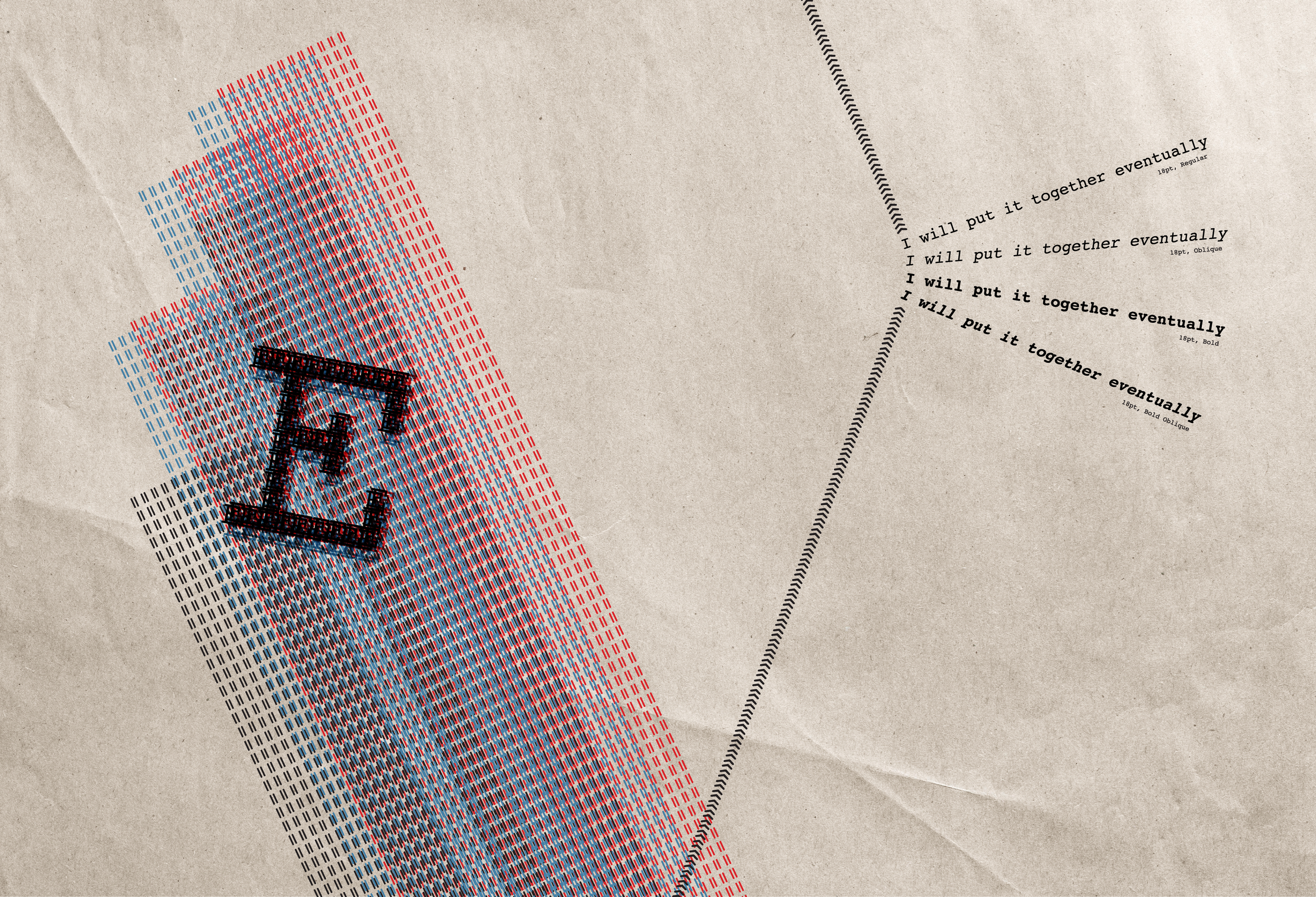
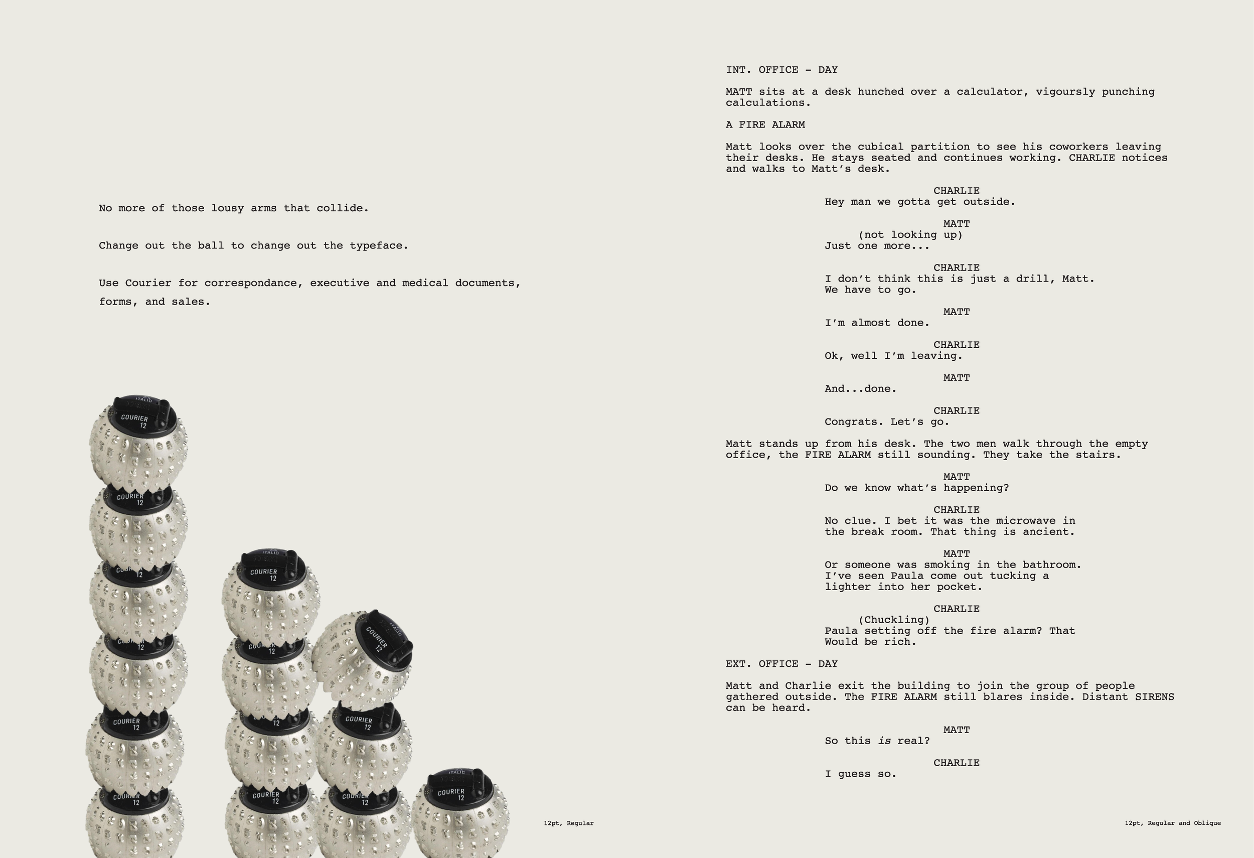
In this typeface exploration, I designed four spreads to be a part of a foldable booklet. Two of the spreads show the practical side of the typeface. And the two other spreads show it in an expressive context to highlight its origins in connection with the typewriter, where ideas, literature, art, poetry, etc. are born.
Preliminary sketches:


